Reading an Image- Media Codes
1) Analyse this RBK 50 Cent advert using the media codes you learned in the lesson: Technical, Written or verbal, Symbolic or non-verbal, Narrative. Write a paragraph for each one exploring the way meanings are created using those media codes.
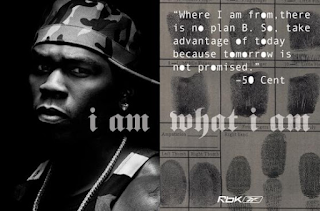
The advert features a black and white colour scheme which connotes a life and death situation which may have been used purposefully to present 50 Cent's past where he got shot 9 times and survived. In addition the text having the O letters filled again connotes this idea of bullet holes. The fingerprints connote a crime scene/investigation however another meaning can be interpreted that maybe RBK are trying to help their audience find their own identity as well as the text "I am what i am" supports this interpretation further more. The quote from 50 Cent is almost purposefully done to empower their audience that despite their past they should not feel ashamed and take everyday as it goes not for granted. Deliberately, they had 50 Cent have direct address with their audience and have a serious facial expression to emphasise the message "I am what i am" 50 Cent wearing a backwards army cap, earrings and a chain all connote a kind of gangs, violence and crime. The black background behind him suggests his dark past however the lighting on his face presents how that does not matter and the audience should focus on him despite his past. However it is purposefully done that despite whatever you look like it does not define you and you are what you are and if people don't accept that it's not the end of the world.
2) Next, analyse a print advert of your choice using the same media codes: Technical, Written or verbal, Symbolic or non-verbal, Narrative. Make sure you add your chosen print advert using the 'Add image' button in blogger (use Google Images to find the advert first and save it to your pictures or downloads).

Comments
Post a Comment